

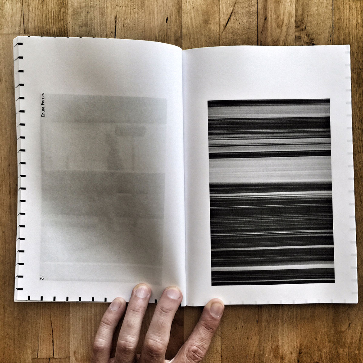


Yet another cool publication from Chloe Ferres. This time a collaboration with her Raffles pals. Pages with vertical images, others with horizontal. The bleed through you see on one of these images is actually caused my by iPhone app. The book doesn’t look that, but this gives me an idea for another book. Damnit. And the envelope came with all these great stamps. A total sucker for that. Almost ate them I like them so much. I’m going to beat a dead horse, so prepare yourself. How is it possible I don’t see more of these collaborative books? At this price? LOCO. Thanks for sending Chloe, when I see something like this in a mail my inner child does Kung-Fu moves.
Comments 2
Bleed through is a really interesting idea.
My sister pointed it out to me in a trade book I did. The photo on the back side, dark and bigger than the one on the front side, can support the picture.
Monks used to do ‘carpet pages’ to kind of cover up bleed through. Am I repeating myself? I feel like I’ve written this comment before. Sorry if so.
Author
AM,
This is where book design REALLY comes into play. Yes, it can actually improve the look and feel of the book. I did a magazine based on this concept. And it worked. I don’t think you wrote this before. but I can’t remember shit anymore.