
Don’t have the foggiest idea what this means. It’s clearly Sanskrit. Too lazy to look it up, but I have a physical copy, so at some point I’ll know. I’ll keep it to myself and let it marinate. I’m that way. I’ve mentioned Wim here before. I believe that the first name is pronounced with a “V” instead of a “W,” but I could be wrong about this. Wim is from Germany. I’m almost positive Germany is in Europe. It’s somewhere “over there.” There is no photograph of him on his “about” page. Maybe he looks like Karl Lagerfeld or Boris Becker. Maybe I’ll check surveillance video.
Wim made a lovely publication, but let me back up a little bit.
Wim found a home with his photography. Wim found a culture, food culture, and the various subcultures that live underneath the broader title of “Food Culture.” Many of you are running around with your cameras, shooting random things, and that’s entirely okay and up to you, but I will stress the beauty in finding a home. I will stress the beauty in finding purpose, direction, and subjects with defined edges, even when those edges are drawn with crayon.

The publication is a saddlestitch, softcover, created with Newspaper Club, a UK-based operation I really like. I’ve worked with this brand over the years, and I’ve had nothing but good luck. Their sample kit is beautiful. It’s roughly 7×10. Not many pages, but YOU DON’T NEED MANY PAGES. If I see another photography book with one hundred images, I’m going to lose it. Who, I ask you, WHO is going to sit through that?” Especially now? Answer: no one. That is why a publication like this is so impactful. Within just these few pages, I know everything I need to know about Wim. Can he do the job? Yes. How do I know? This publication.
Yes, people, it’s that simple.
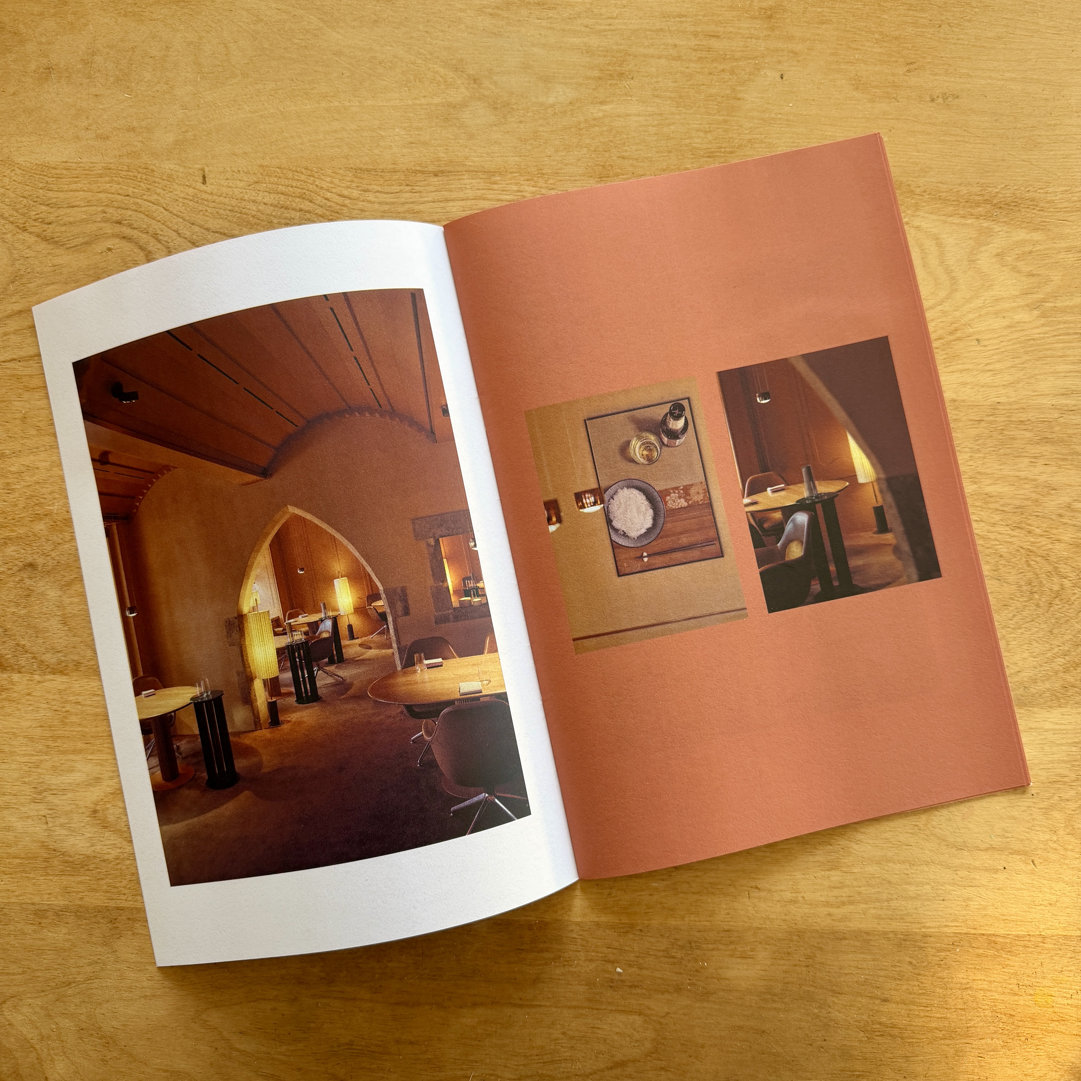
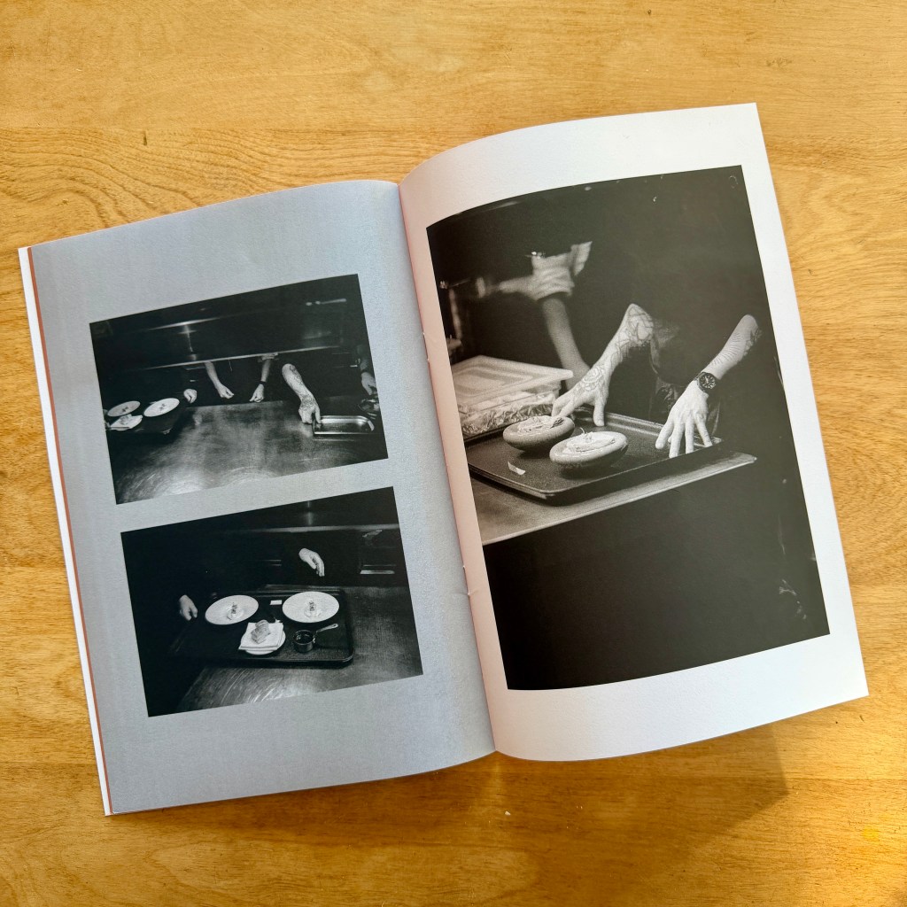
This little thing tells me everything. Simple people, arty people, details, locations, quiet moments, and it shows me he knows how to read light and can work in both color and black and white. It also shows me he knows how to edit, something many of the 100-image book people clearly don’t know. I love the color wash, which transfers over to his site if you care to take a look. Cost-effective, beautiful, concise. This is what a promotional print piece is supposed to be.

Comments 10
Nicely done and inspiring. Thanks Dan & Wim!
Author
Oh, ya. Thank you!
Really nice. The words too.
Author
Gracias!
A great article, good food (NPI) for thought. I am thinking of creating a photobook(s), and a softbound book with a limited number of images with accompanying text seems like a great starting point. Wim’s use of different color pages is something I would not have thought of. I might consider that, if I had an advisor to help me with color choices. Looks like the equivalent of the art and magic of choosing a complementary mat for a framed image.
Thanks for this post (and inspiration!).
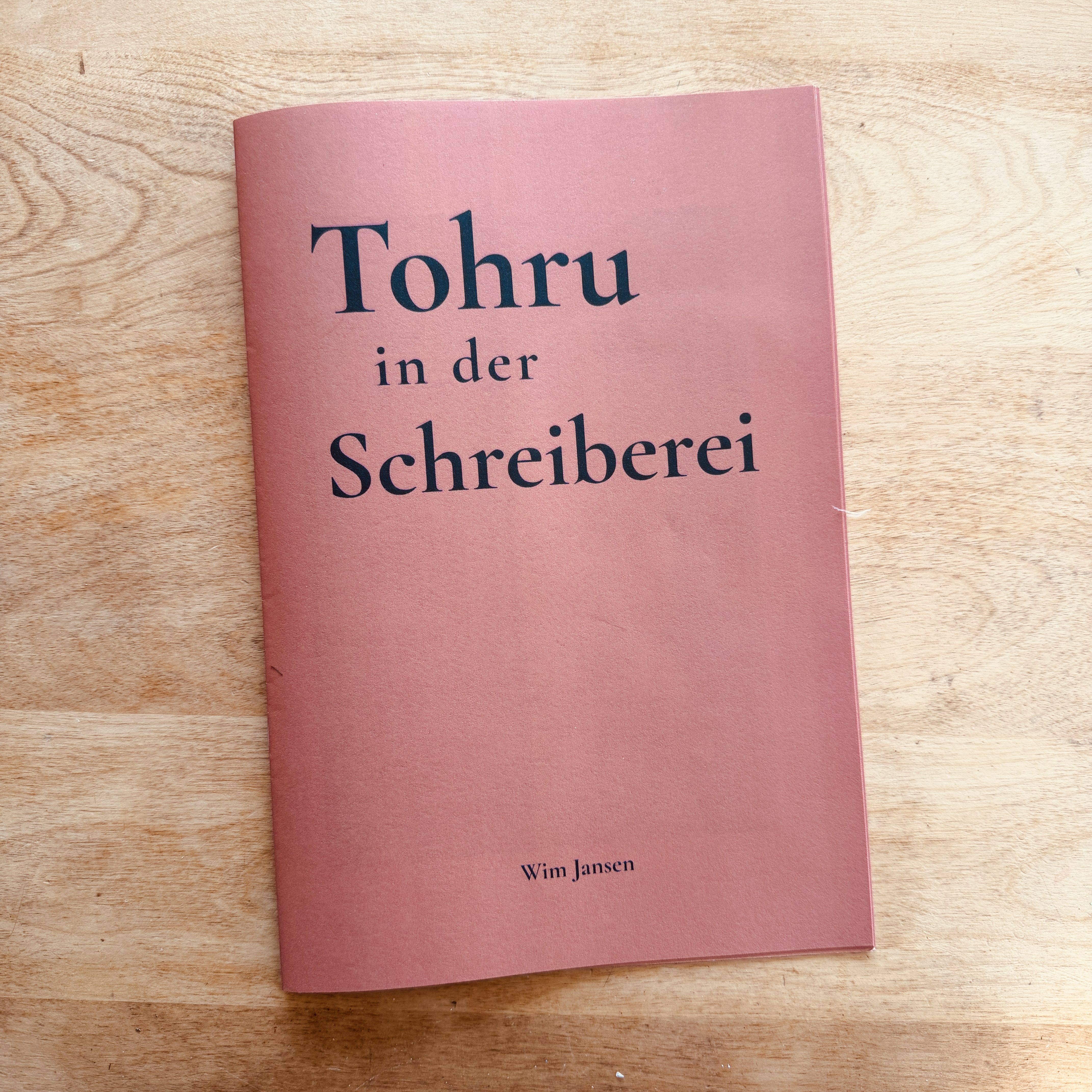
BtW (although you probably already know) – Tohru in der Schreiberei is a restaurant in Munich ( I didn’t know this; I used a search on that text).
Author
Munich is in Argentina right? As for an advisor….just start playing. That’s how we all begin. And I too love those color washed pages.
Thank you, Daniel! I really appreciate the feature and your generous words.
The work came from a reportage assignment for the MICHELIN Guide about Tohru in der Schreiberei in Munich, now a Three-MICHELIN-Star restaurant.
The idea behind these small publications is to give every client a thank-you copy and something personal and lasting they can keep. With this one, I wanted it to feel simple, focused, and intentional, while still capturing the atmosphere and detail of the restaurant.
It means a lot that you picked up on the rhythm of the edit and the mix of color and black and white.
Thanks as well to everyone here for the kind comments and encouragement.
Author
So smart, and it looks damn fine. I’m keeping mine!
Beautiful photos and a well written, witty post to back it up – excellent job and props to both of you!
Wim, Daniel… keep up the great work!
Author
Thank you!