
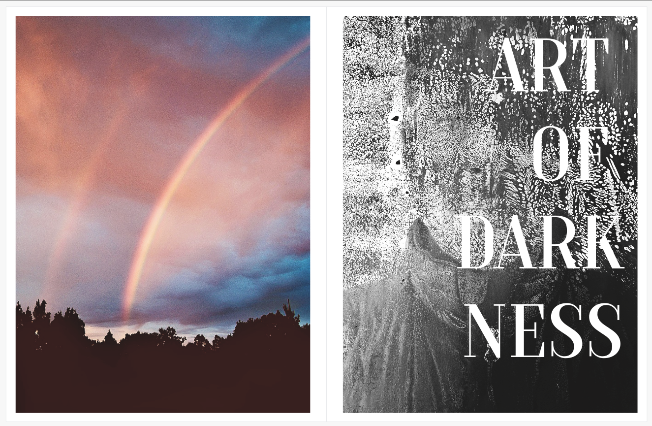
Keep your pants on. That’s a scan of a recent art piece on the right. Don’t want anyone getting too overtly jealous of me. I couldn’t live with myself knowing I’d reached the pinnacle of my artistic powers, and that those powers had rendered the rest of you powerless against me. This post is about palette. This post is about mixing and matching palettes, and the complexity this adds to one’s book project. “Can I mix color and black and white in my book?” is one of the most common questions over the past fifteen years of Blurb service. I’ve been asked hundreds of times. I always reply the same way. “You can, but this will increase your degree of difficulty.”
Casual bookmakers fight me, while the pros don’t even ask this question.
I just took a quick look at the closest FIFTY traditional monographs here at the ranch. Not all are classic monographs, but all are traditionally published books of long-form projects. There are hundreds more I could look at, but I don’t need to. Guess how many of the first fifty were mixed color and black-and-white. ZERO. Hmm, wonder why? It’s because cohesion is critical. One wrong move, one image out of sequence, one layer of unneeded complexity, and the viewer is GONE, back to their mobile device and its accompanying dopamine dreams. Gone, baby, gone.
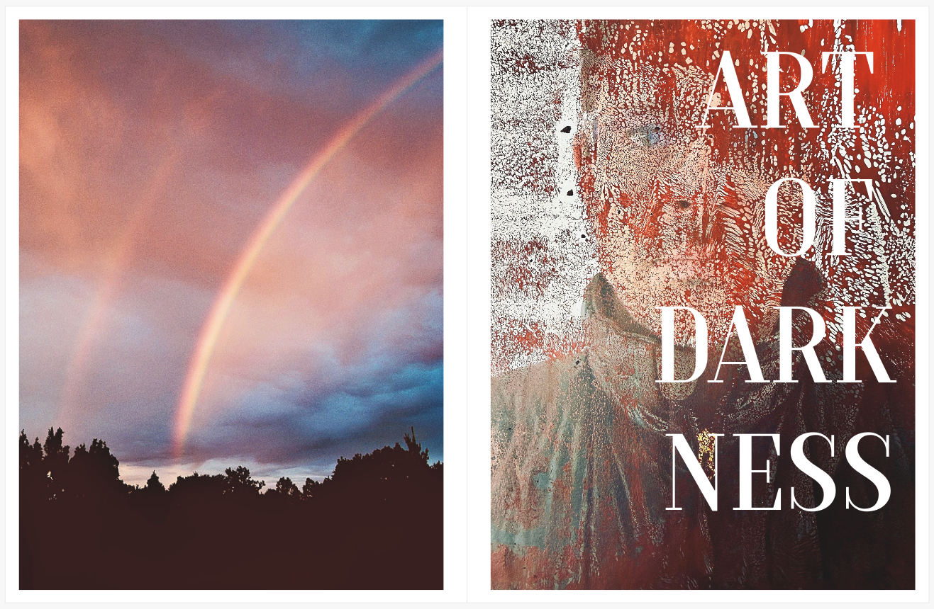
When we mix and match for no other reason than “I like it that way,” we forget our audience isn’t us. Our audience isn’t invested in photography like we are. Well, I hope you aren’t making work strictly for other photographers. That’s not enough, peeps. Do more. Civilians don’t invest as we do. They need help. Start throwing around different formats, image sizes, typefaces, color and black and white, and watch them put your beloved baby on the deck. They don’t want to work that hard. They will leave you.
Look, if you are making something for you, your family, or another group of photographers, it doesn’t matter. You can do anything. But if you are putting something out into the world, you need to think about this. This is one of those times when you can’t say, “The audience comes last.” I ran into a photographer who fought me on this because he had some mixed books. But when pressed, he said he only sells to newsletter subscribers and fellow photographers, proving my point. (He sells a ton of books.) There is a reason my monograph collection is 95% single-palette books.
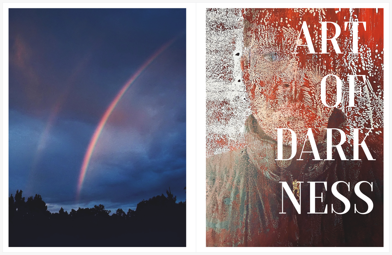
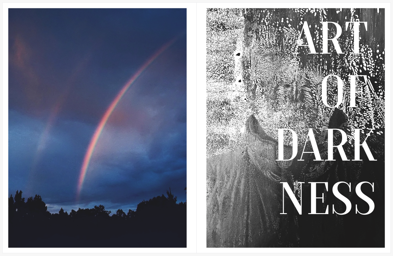
The last thing I’ll say is that doing these tests is critical. How else can you know how things fit or don’t fit? I keep an open document I’m experimenting with daily. I mix and match, replace, reduce, start over, and then find the cohesive path forward. I will say you can mix palettes with imagery and text. That works, although even that isn’t that common, and when it’s deployed, it’s often subtle. And finally, rules are meant to be broken, so prove me wrong, but keep in mind the things I’ve metioned above, and keep in mind those monographs.
Comments 4
I agree with you that mixing is quite challenging, Dan. An author that seems to pull this off in some of his books (both handmade and published) is Ray Meeks. One reason it seems to work is because of content and secondly, is because he uses a muted pallet in both his b&w and color images.
Author
I love Meeks, and his bookmaking skills are superb.
I hope the cover name is a nod to Joseph Conrad.
Author
you bet!