
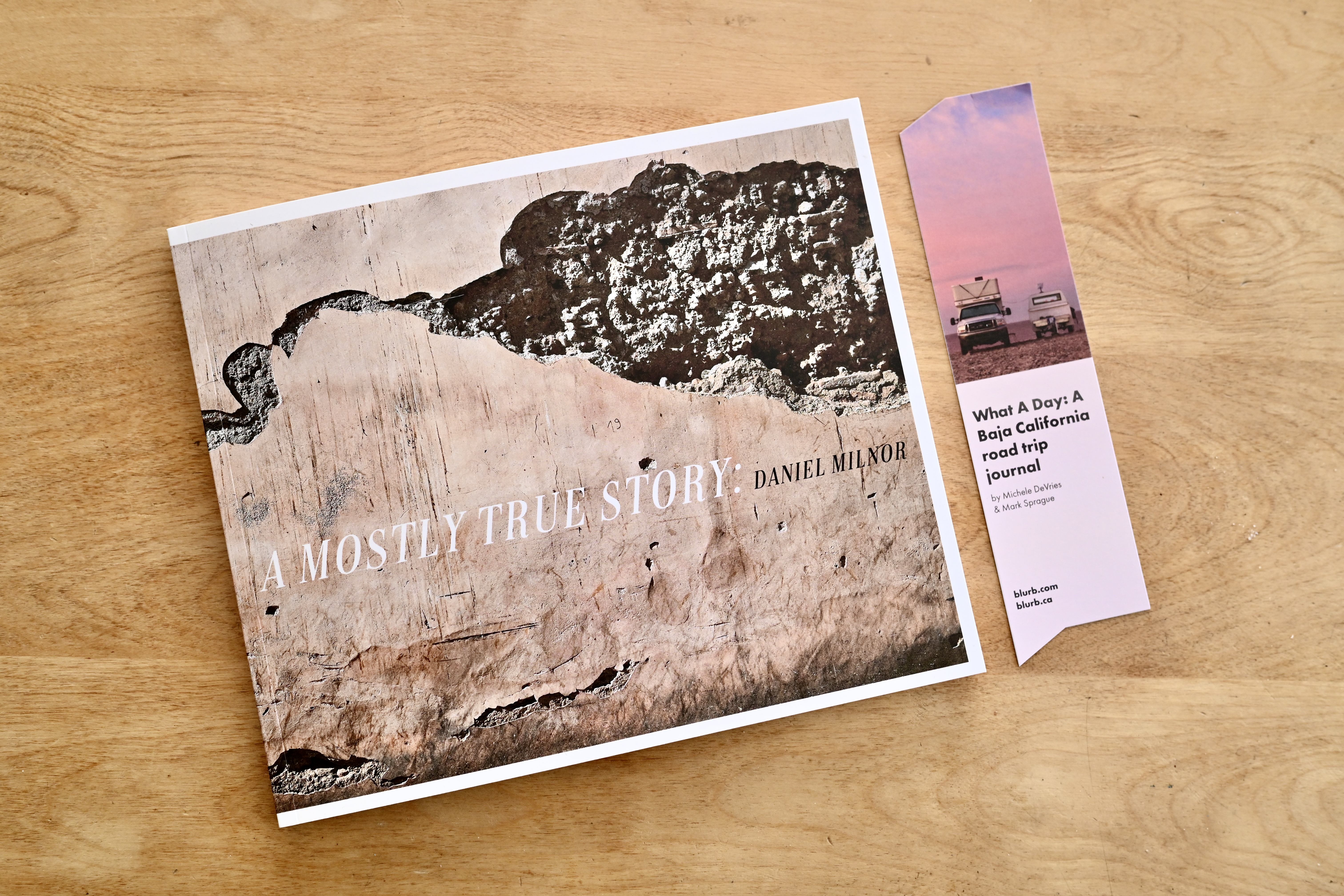
I knew this book would be a challenge. I’ve made this book many times, with many different stories, and I’m never quite happy with it, which is why I keep attempting to make it work. I KNOW how to make it work, don’t get me wrong, but I fight against it. A Blurb 8×10, matte, softcover photobook, with Mohawk Eggshell, a paper I truly love.
Depending on the bind, running images across the gutter can be challenging.


This is the part I knew going in, but there is something to keep in mind. First, I still love how this book looks. When an image successfully runs across the gutter, it’s like hitting a home run. It looks and feels great. Just remember that images toward the front and back will lose less in the gutter than those in the middle of the book. That’s just a natural occurrence with a bind unless you use layflat or a sewn bind. So, I knew there would be spreads that worked perfectly and others that would not. This is my only frustration.


I will say I LOVE the new matte covers. I don’t want to use anything else. I begged for these for fifteen years. The current CEO would see me coming and just shake his head, saying, “I know, I know, matte covers.” I would bring up matte covers in every single meeting, regardless of what the focus was intended to be. It worked!

If this were a real book and not a test book, I would have designed the inside pages differently. I would have still gone doubletruck, bordered, just not nearly as many, and there would be WAY more text. The story would be included in writing throughout the entire book, and I would have built out both the front matter and back matter, allowing the book to breathe.


You might notice the images look a bit textured. I added some in-camera texture, a first for me. It’s supposed to mimic film grain, which it does not, but I still like it. Sometimes I love the perfectly smooth textureless feel of digital, and other times I do not. This will also be greatly impacted by paper choice. This eggshell paper has a slight texture, which will emphasize the in-camera added grain. The next book, which has also arrived, will show you what these pictures look like on a coated paper with less texture.

The spread above shows two men on their phones near the coast. I like this picture, but I don’t like it on a spread. As I mentioned before, the closer to the center of the book, the more you lose in the gutter, so this picture gets too fractured for my liking. I would run this left to right, but editorial style across the gutter, but not to the edge of page.

This spread, with the wall of ancient dirt and splash of red from the trash can, works but barely. The can is ever so close to the gutter. But I still feel the overall spread is doable. I love pictures like this. Things I would have historically never photographed, but when bookmaking is the goal, photographs like these are pure gold. Informational more than graphic, although this one fits both bills slightly.


These two spreads work better. If I could hold the book with both hands, you would see the arm of the guy on the left can be seen. Shooting and holding the book is always a challenge. Another thing to remember, most people are looking at photography on a phone. One of the lamest ways to ingest photography, so when they see an image in print that is over twelve inches in width, it can stop them in their tracks. That’s why a good book works differently. If shot well, edited well, and designed well, a book makes an impact unlike anything else. This book has been a great experiment for me, and one I will learn a lot from. The “final” book will contain elements you see here.
Comments 12
Wonderful inspiration as always! Thank you Dan.
Author
Thanks Jon. I hope these book sketches connect some dots for people.
Did you have that book size in mind when choosing to shoot 16×9 in Morocco? Seems like they are a perfect pairing!
Author
I choose the image format first, then adapted it to all the different book sizes. I love the challenge of new formats, and how they will impact the overall design. I’m still working it out, but I do love the 16×9.
In the image with the red trash can, couldn’t you crop out the right-hand cannon ball and shift the layout image to the right pushing the can to the right and further from the gutter?
Author
Yes, plenty of ways to wiggle around. However, based on my crazy strict training back in the day, I always find myself hesitant to crop. Must be the being yelled at part that stuck with me.
Danielsan, Much respect for all your images. But, the first double-truck. The condensation and resulting water rivulets, in relation to position and highlight of the layered subject matter…Stunning!
Author
Hey Jeff, it’s funny you should mention that frame. I made that on the train halfway between Tangier and Marrakesh. I was getting some fresh air. Standing between cars. We stopped at a small, rural station and I made two frames of this scene. The second I made it, I said to myself, “This is the first image in a new way of seeing.” This was 16×9, added grain, color, Fuji, etc.
All the better.
Pingback: Creative: Blurb, Zero Day – Shifter
My Pet Hate photos spread over a gutter . .
Author
Gotta get over that. It can be glorious.