
I look at books. I look at a lot of books, magazines, and Zines, and a wide range of anything that ends with “print”. When people ask about bookmaking and ask how to improve, I always say the same thing: “Look at books.” Go to the library. Hit the design, illustration, art, and photography stacks and take your time. Make notes. Use your goddamn mobile phone to snap images for later. I know how you jackals operate, and that’s why I love you so much. I can’t hook kick all of you, but I would if I could. So, look at books. Learn. Take your time. Did I mention that before? Or maybe take your time.
Last night we had some legends over.
“You are faster than anyone I know.” This is what someone said about me last night. “I don’t know anyone who moves as fast as you, projects into books.” I’m not for everyone, nor is my pace. Another legend asked me what part of my father I was carrying around. This is after I told him about Dad being thrown out of three universities after enduring military school. “He showed me how to work,” I said. “Never sit down on the job.” “Don’t quit.” “Don’t expect anything.” His father ran a grocery store and forced him to run it too. “I had to talk to the old guy down the street, and the racist guy, and everyone else,” he said. “I had to interact with everyone.” This was after we spoke about the under-30 crowd being socially inept. Not all, but many. No hellos, eye contact, handshakes, introductions, or even acknowledgements while hiking or cycling. Just looks at the ground.
The legend to my left said his father was a professor who would have ten students to the house to debate and discuss. And his father made him attend, or allowed him to. My guess is, based on being around him for years, he would want to be there. Exposure. Early exposure that gave us skills we utilize today. Skills that need to be learned and practiced. Skills that allow you to command the room, to steer the narrative. “He taught me how to say excuse me,” said the legend on the right. “When I’m in the field, that’s always the first line,” he added. “And then I don’t leave, I linger.” This is how documentary works. The same legend spent ten years on his latest book, and seven years on the book before that. This is what’s happening.
Speaking of learning, I’ve got SO far to go.
Name it. Spanish, sketching, photography, journaling, writing, blogging, working on a marketing team, etc. I feel like I haven’t started yet. Oh, and bookmaking, which, after all, is the basis of this post. I had no formal design training, aside from one class where I had to design a book cover for The Last of the Mohicans. Not to blow my own horn, but mine was great. Completed with a T-square and tracing paper, mind you, long before computers descended on UT Austin. So, the bookmaking side of my life has been a thirty-year game of catch-up. Some of you can design; I’ve seen your work. Others are struggling, like me.
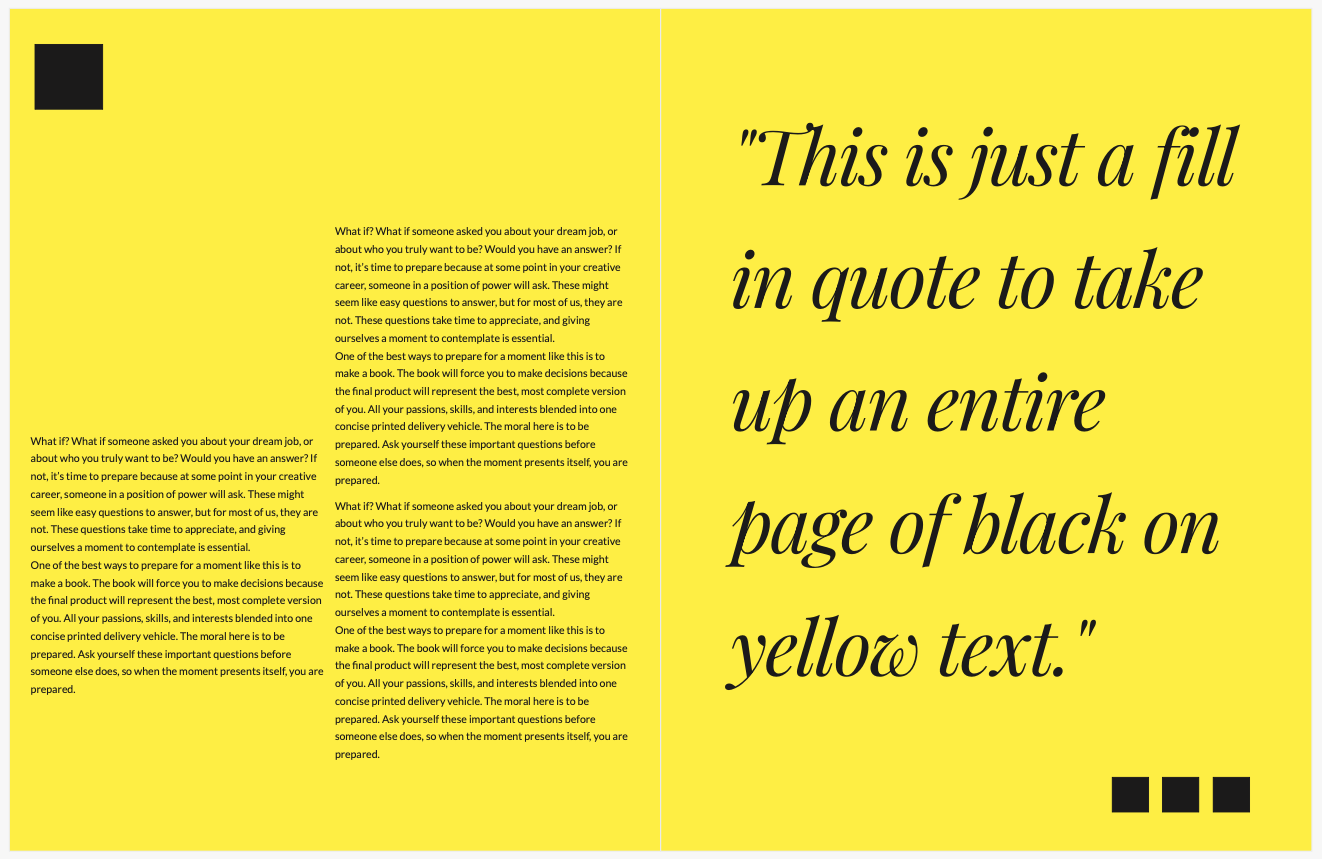
One of my techniques is to break the rules I’ve created for myself. I’m not a fan of colored backgrounds with photographs. Not even black. Of the three hundred remaining monographs I still own, only a handful utilize black backgrounds, and those cover intense subject matter. I prefer white. Earlier today, I saw a page similar to what you see here. A yellow page with black text, beautifully designed. (Better than what you see here.) It stopped me in my tracks. “Wow, let that color POP, “I thought to myself. So, I stopped what I was doing, opened BookWright, and made this page. My dimensions differ from the page that inspired me. They had three blocks of copy on the right side of the left-hand page. And they had an additional small body of copy below the copy on the left. The general idea is the same.
The color. Jesus Christo. Where have you been my whole life? Let your freak flag fly. I love this look. I’ve also been studying design books. I have one from Phaidon that blows my mind. I can open it anywhere and find immediate inspiration. Lots and lots of color with type and page design. I’ve got to loosen up for shit’s sake. Using color will also depend on content. Am I going to use yellow to showcase my expose on explosive diarrhea in the United States? Hmm, maybe. But there could be more poignant colors. This is an addition to my existing arsenal.
Comments 5
Why do people get bored? Learning about stuff never ends and makes life endlessly interesting…..
Author
Brain rot from screens. Real life seems boring after. Not to me, to them.
Well, I mean, black text on yellow. Police tape, caution tape, dozens of warning signs for drivers and bikers – and really the iconic yellow NYC cab – and of course street signs… our brains are programmed to pay attention to black on yellow. Had that page been pink, violet, pale blue – you get what I mean – the effect would have been different. So… did the color pop? Or is your brain trained to pay attention to that particular combination of black text on yellow. Just a thought.
Danielsan…My office window began streaming morning light onto my photo desk, lighting up the dark amber roast of a fresh cup-of-joe…My first thought. Yes, a much more poignant color for your upcoming expose. A mental picture that for most would have started an involuntarily gag reflex. I took a big-swig of the hot, semi-transparent brew and thought…Man! That’s good.
Author
That sounds like an epic morning. I keep my fly rod in my bathroom. It’s calling me.