
Good things come to those who wait. Blurb swatch kits are back. The timing could NOT be better. A swatch kit isn’t a miracle in paper form. A swatch kit is a starting point, but yesterday I had something happen that made me laugh and wonder. My first Patagonia test books arrived. In some fit of confusion, or too much on my plate, or me simply moving too fast, what I received what not what I thought I ordered.
I planned to have two books with the same content, one with a landscape aspect ratio and the other with a portrait aspect ratio. Softcover, matte, Mohawk Superfine Eggshell.
But is not what arrived. I got my landscape book in softcover/matte, but the paper wasn’t Mohawk, and the portrait book was a hardcover imagewrap, and it too was void of Mohawk Eggshell. I looked at both books and thought, “Did I do this?” I checked my Blurb author page, and sure enough, this was on me. But here’s where things get interesting. THE BOOKS LOOKED AMAZING. I’ve made over three hundred titles with Blurb, so getting books or test books is nothing new.

The matte cover on the softcover looked fantastic. And the imagewrap on the hardcover, with its slightly more contrasty look, also looked fantastic. But where things got surprising was the paper. For some unknown reason, for the first time in at least a decade, I chose “Premium Lustre” paper. Good God almighty does this paper rock.
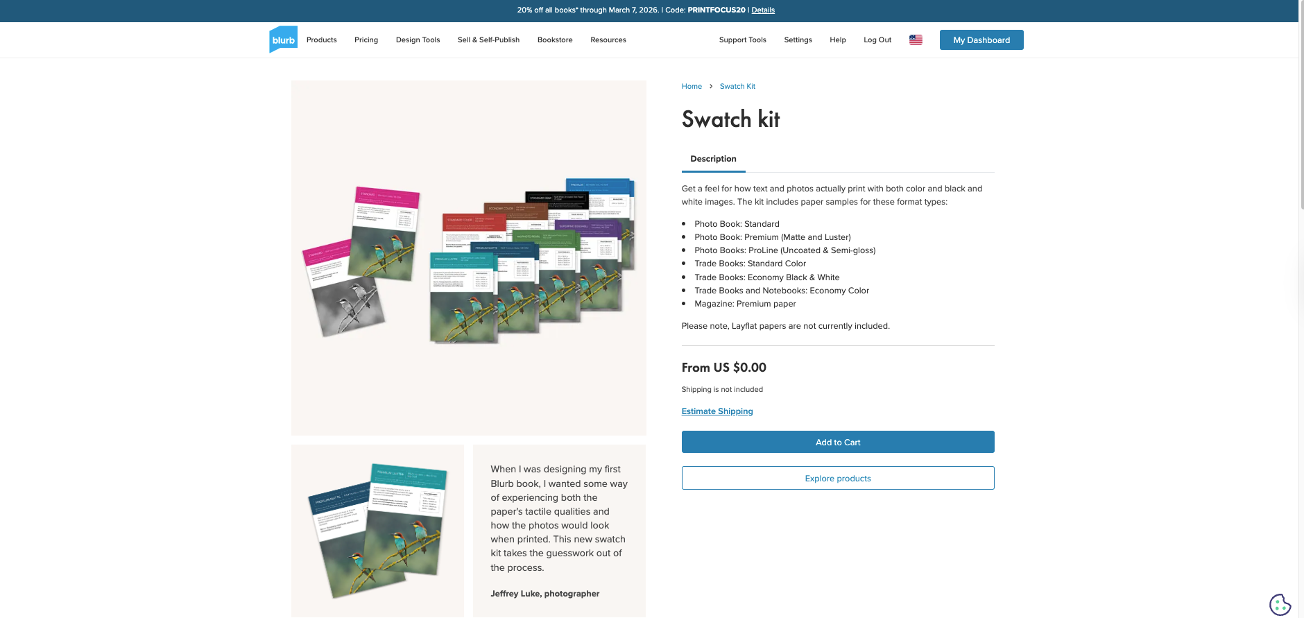
I can’t believe how good this paper looks in both color and black and white. It’s thinner than the Mohawk, has slightly more sheen, but feels like high-end magazine paper in a photobook. Where have you been my whole life? Why did I not use this paper before? Why have I not used the other premium option, matte? This is where a swatch kit would have come in handy. A swatch kit will not have my imagery attached to it, but it will provide me with a foundational clue as to what paper might match my project and desired look.
Patagonia was a mix of color and black and white.
The books are more portfolio than narrative because my mission was to scout, not focus solely on one project or story, so this paper fits the look I was after. What’s interesting is that I was looking through my copy of Emily Shur’s “The Woods,” and I thought her paper choice was perfect for the work. This must have crept into my mind as I chose my paper for these sample books. Live and learn, Milnor, live and learn.
Once again, I need to remind the skeptics and haters that these are test books. TEST BOOKS. In other words, the price of admission for anyone serious about making books. Also note, making test books makes the entire process more fun. You get to experiment, tinker, and try things, and only have to print one. Finally, I pay for all my books. Blurb does not. This shuts up the haters who try to move the goalposts by saying, “You only do books because you get them for free.” Sorry suckers, try again. Don’t be afraid, hit print.
Comments 8
Danielsan, Funny, I’ve been the exact opposite of you with Blurb. I’ve only used the “Luster” as I’ve printed with epson “Luster” for years. It looks about the same, with colors and B&W.
Just finished another Fly Fishing Book with that paper. Looks the same as my original files.
Author
That’s how this feels. The prints look like digital files. Glorious.
Ordered the swatch kit, free plus shipping, which was $7.95 (USD?) to Canada. Yay!
Author
Shazam!
Unfortunately not available for Australia
Author
Not yet….but let’s see.
Shipping is $71.49 aud to Australia unfortunately 🙁
Author
Good grief….