
Welcome to photography school. Well, except for the projectile vomit, rampant promiscuity and angst ridden smoking in windowless stairwells. Imagery, actual imagery. Light, timing, composition. This is what photography dialogue should be about. This, my friends, is a return to Notes on Photography, a series where we break down individual images.
This photograph was made during my recent trip to Antarctica. While I would not classify this image as a world-beater, I would classify it as containing certain specific elements that could be used to comprise a decent image, and I can certainly explain my rationale for making it. An untouched version of the image is below.
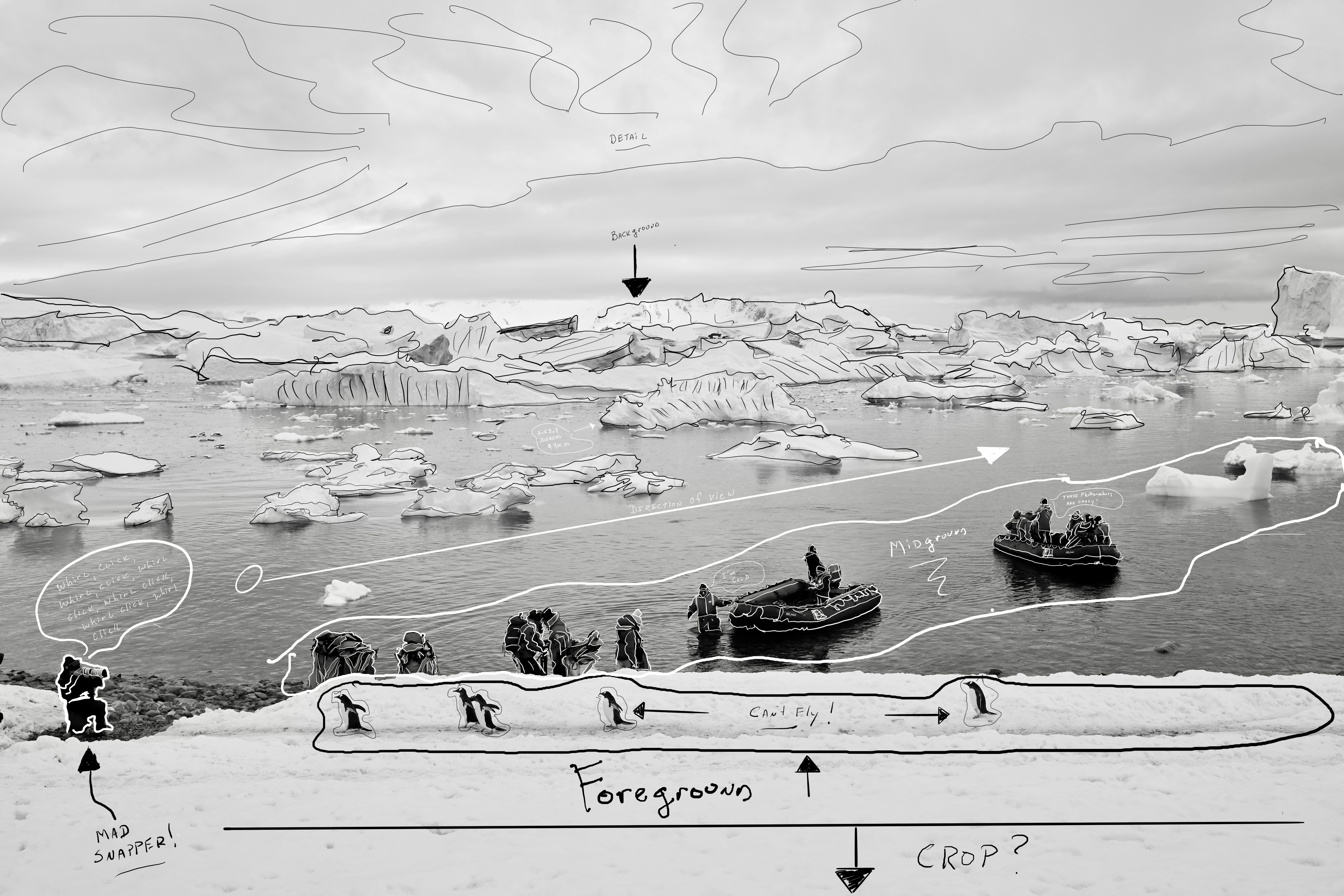
This image was made with a short lens camera I carried around my neck.
I had second and third longer lens cameras as well, but they were used for a very different style of image. I also had a mobile phone and an action camera because I am a total idiot. Let’s get back to the short lens camera. This camera was set to black and white for the entire trip. From the time I walked out my front door till the time I returned, this did not change. Why? Because I was looking for a consistent theme of black and white, short lens imagery. If I concentrated on this style of image for the entire trip, I might then have enough for a book, or a design element.
The lens used was 40mm, which is an odd middle ground between wide angle and standard focal length. I happen to love this focal length, but do not for one second think I want you to comment about the equipment used. Remember, this is about the image, and what I was thinking about when I framed this baby up.
The 40mm offers slight compression, foreground to background. It will also offer beautiful falloff at wide aperture, but remember, there is a reason why lenses have f/8. It’s called depth of field. Had I shot this at f/2 the midground and background would have been soft. There is reason for an image like that especially when it comes to bookmaking where a soft image has more usefulness when it comes to things like type, but in this case I wanted your eyes to move from the foreground to the midground and ultimately to the background. Hence the need for a smaller aperture.
The first thing I noticed was was the line of penguins. Shocking, I know. Fat little creatures that can’t fly wearing tiny tuxedos. But I also knew the lineup of humanity in the midground would provide a good contrast to native vs non-native antarctic creatures. And I knew the background, this incredible bay, was vintage and alluring. The idea being, the penguins are just going about their day, on their well worth path, while the humans are mucking around with Gore-Tex, Yamahas, and 8k video menus.
I shot three frames total.
This frame was chosen for the spacing of penguins, the body position of the photographer anchoring the image to the left, and the spacing of the humans in the midground. The background isn’t moving at a speed I need to worry myself about, and the sky and water work as a giant softbox. Far from being dramatic light, this is safe light, easy to work in with no surprises and no need to consider wild exposure swings. The cloud cover provides detail in the sky.
This picture is simply about seeing potential building blocks and make a few quick images. Would this image make a final take from the trip? Probably not, but were I to need an image reflecting animal proximity or an image that depicts current antarctic relationships, it could work. I would potentially crop the foreground slightly. The goal is for the viewer to engage first with the penguins then work left to right up the dynamic element of the midground while eventually taking in the background and overall piece. Viewer experience may vary. Would this image work on social? No.(Social images look mostly like NG covers from back in the day, known today as “bangers.”) Too many moving parts that require way too much time. Would this image work in a book? Oh ya. Perfect seam down the middle and plenty of room for a small copy block that slows the reader down. It is easy to look at this photograph and lose the penguins, and that is the point.

Comments 51
Good to see some of your Antarctic work Dan, and your thoughts.
Author
Much more to dissect.
Very useful breakdown and insight. Thank you.
Missing you already on yt. But hey, i just found out some q&a vids i’ve not seen yet. Greetings from Spain.
Author
Send me the questions and I’ll add them to my Podcast.
Reminds me of a photo of Earnest Shackleton and his crew, well minus all the despair and impending doom. I totally dig it as I love acute angles and there is one in this photo… well played.
Author
Shackleton’s name comes up all the time. Those guys were insanely durable. I would died a hundred times.
Looking at my older photos, I realised I used layering sometimes, subconsciously.
Triggered by your videos, I started to apply it consciously. Definitely an improvement.
Author
That’s a good thing. Means you are already thinking that way without thinking…like Bruce Lee.
Loved seeing something from Antarctica trip! Would love to get my hands on any book you make based on this trip (if its for sale). As usual the analysis is informative. The frame has a different approach to such a remote place on earth.
Author
So far, just a journal but there is also a portfolio in the works.
Thanks for the breakdown, I like the middle-ground diagonal and relationship contrast between the ice and people, pretty cool. Have a good weekend!
Author
Thanks Alim. Layers and leading the viewer’s eye to where you want them to look.
Love the breakdown of this. Makes me really think about how to compose a better. I wanted to ask, why do you have “crop” in the notes on the first image? Based on some of your previous comments, I am a bit surprised to see you mention it.
Author
I put crop there because I could move in slightly and not lose anything. Might even be better cropped slightly.
Very cool. Have always liked this feature on Shifter. Love the photo. I forget – how do you make notes/drawing on the image?
most native gallery apps on phones have a pen feature built right in, would be even easier on an iPad if you had one.
Author
I use my eight year old iPad Pro.
Great
That is a nice series and well worth continuing. Thank you. Now get started in photoshop and move the penguins around for perfect spacing the same for the ice bergs and then have a sky replacement ai do its thing. Then ai upscale it to 100mpix and upload it on instagram so we can view it at a tiny screen wile having a dump.
All the best
Frank
Author
Hey, I know photographers who used to be ethical about all this who now do just about everything you mention, sometimes more. I blame Instagram. People just cant’ stand not getting the number they think they deserve.
Great frame Dan, I’ve followed you since the Dan-Bag/Smogranch pre YT days so not really missing you on that platform at all, generally watch you through Shifter anyway. All the best with the new format. Stockpiling TimTams for your next venture to OZ!
Author
Hey Chris, really happy you are still here. I think the next chapter will be the best chapter. Oz in on my list, again. Not sure when.
Hey, Milnor. Just found you here from a small little box on YouTube and decided to read your post. It’s nice that I can do that, and if there’s a way to be able to subscribe to Shifter.media I will do that—I enjoyed reading the article and looking at the photo from all corners. Cheers from (RatGirl my YouTube handle. My deets are below.
Author
Hey Rat Girl, glad you are here. And yes, there will be a way to subscribe. RSS maybe. You can do it now if you make a comment, as you have already. There should be a toggle that asks if you want to get subsequent posts.
It’s great that you’re reviving this theme — they’re always informative and useful, and this is a perfect example of concision and instruction that doesn’t feel like a lecture at all. Thanks!
Author
Lectures suck!!
Really really enjoyed this, Dan. As somewhat of a “budding” photographer, I enjoy your to the point commentary and insights. I’ve hated YT and Insta for a while and haven’t quite been able to drop it yet. But this is what I’ve been looking for to really get me to disconnect. I want to focus on learning and doing it for myself and be authentic instead of this chaotic treadmill people keep telling us to run on. And you sir, are a man of action to prove that the “influenzas” that talking about it doesn’t change anything.
Author
That’s what I’m here for. I’m hoping to take you along and share what I know. MIght not work for everyone but hopefully it works for you. Much work on the way…
Can you experiment with sharing the raw from one of your images and let your community edit with their own perception in mind? Could be a great exercise.
Author
I can do that. Can also share a subsequent frame that didnt’ make it.
Only three frames- I can relate to that. I have not shot film in any format for 15 years but still have the mind set that the camera is loaded with 12 or 36 exposures. I shot film for 30 years before that so if I can’t get the light, composition and positiioning right in a couple of frames, squeezing off 30 isn’t going to help. Thanks for returning to this series.
Author
Yes, us film heads have an advantage of limitations. I’ve always said the limitations of film are what make it so great.
I booked the iceberg for the month of June. Can’t wait!
Author
Make sure you leave a good review.
Wonderful image Dan! Is that what the B&W looks like straight out of the Nikon or is that your own concoction?
BTW, did you see the camera review by Sam Abell about the new X1006? It is superb! It’s about a 10 – 15min film and he mentions the camera about two or three times! The rest of the review is just him talking about how to photograph! My kind of review! LOL!
Author
I heard about the film but have yet to see it. The black and white is straight out of the camera…..
Thanks for this photograph breakdown, it’s helpful to learn more about layers. Unfortunately, no penguins about here in Las Vegas, but plenty of Grackles.
Author
Work with what you have. Or photoshop a few penguins in. Nobody will know.
In the old days, before the Internet, influencers and snake oil salesmen inherited the Earth, people who wanted to get into photography seemed already to know several things: the type of imagery (genre/genres) that had attracted them in the first place; they realised that the more stuff you looked at, the more you assimilated and grew. The photography magazines basically ran the reader information gamut from how to expose, how to process and then to the various cameras that were available to buy. The better ones, such as the UK’s monthly Photography magazine, edited by Normal Hall, often ran interviews with top professionals. Equipment reviews, or rather, their values, depended very much on the individuals charged with doing those reviews. In Britain, for example, the then weekly British Journal of Photography was fortunate to have the late Geoffrey Crawley, a man of vast experience and technical knowledge.
I don’t know who did the honours for Popular Photography, US camera or any of the other transatlantic monthlies as I didn’t buy them. What I did buy were the two Annuals that Pop Phot put out each year: the eponymous Annual and also the “Color” one. They were wonderful publications, and for me, living in the UK, a breath of fresh air, two windows to a world invisible this side of the Atlantic, a break from the over-lit, Karsh-clone, camera club pix of old guys in heavy sweaters, puffing pipes and pretending to be fishermen.
Those two annual gifts from Pop Phot, along with Vogue etc. that I bought locally, gave me all the insight into what it was about the world of images that I wanted to spend my life doing. It was a clear, unambiguous learning curve, a signposted route to the Holy Grail. It was a personal learning experience; all that came from outside were the images. My own eyes taught me what worked, what did not and I’d suggest that that route is the only one worth following. Today, you don’t even have to buy the magazines: it’s all out there, for free, on the web. If one lacks the ability to figure out those basic properties for oneself, then I’m afraid that one is looking at the wrong hobby. Frankly, it strikes me that it makes about as much sense as poor old tuneless me trying to cut a record. The truth is that no, we are not all created equal, and thank God for that!
Author
This is both hilarious and right on the money. And I would search out French Photo because it was SO much better than American Photo. Popular Photography was the old men pretending to be fishermen, as you mention.
Great breakdown of the image Dan – it has a humorous overtone as well in my mind. Are the penguins the welcoming committee? Or are they getting out of there as fast as they can because they see these boats and people arriving? Or maybe they are working the runway and modeling some new feathers for the photographer as part of a penguin fashion show?
Author
It’s hilarious. The penguins have no land based predators so they just don’t care. They walk right up to you. And you have to get out of their way. They are like tiny, drunken men.
This critiquing of your own work brings back fond memories of Photography 102 class at a small community college in NJ. It seemed sometimes brutal at the time but we were all thin-skinned idealists out to change the world back then.
FWIW I would love to have seen the other two pics; it’s just as important to explain – and see – how a pic didn’t make the grade as it is to show why one does. And personally, I would have added a thought bubble above the rightmost penguin saying, “Hey! Wait for me!”
Love the pic – love the narrative – looking forward to “Creative Notes… 16″
Author
Yes, I was thinking of adding a second image that didn’t make the cut. Good idea.
I really enjoy this content and I agree with your crop idea in the annotated image.
Author
Yes, could use a little nip and tuck.
What Podcast?
Author
For What It’s Worth. Just an audio podcast I’ve been doing forever. You can do a search on this site and find it. Or go to Soundcloud.
Dan, re. French Photo: I still have about a dozen of them left from the 80s. I started to buy the American one as soon as it was born (available in Spain at the time) and it was a very different kettle of fish to the French one. One of several differences was the prevalence of travel packages advertised to American readers – presumably due to the differences in American wallets and French ones. As I believe I have written before, another difference was to be found in those kinda vaguely important, if fanciful, listings of things such as “the world’s one hundred most influential photographers” where a larger number of them in the American Photo copies were American photographers. Such was marketing – on both continents!
I stopped buying either when my professional ‘phone stopped ringing, and I did the decent thing and retired. I had fondly imagined that my little stock of transparencies was going to be my golden nest egg; I was, as often, mistaken. But God smiled, and I am still able to eat. 😉
Author
First time I saw dead American soldiers from Iraq was in a Euro magazine. Didn’t have our censorship.
Thanks for the breakdown and the inspiration.